The color and style choices for 2026 point to well-being, nature, and technology in favor of comfort. The decor gains emotional depth, functionality, and sustainable impact.
| Short on time? Here’s the essentials: ⏱️ |
|---|
| ✅ Key Point #1: Transformative Teal and calm blues bring focus, freshness, and modernity 🌊 |
| ✅ Key Point #2: Earthy tones and certified woods elevate coziness with low impact 🌿 |
| ✅ Key Point #3: Avoid excess dark shades without warm light and proper contrasts 💡 |
| ✅ Bonus: Use light neutrals as a base and add a vibrant accent in accessories 🎯 |
Colors and styles that are trending in 2026 decor: biophilic palettes, calming blues, and purpose-driven greens
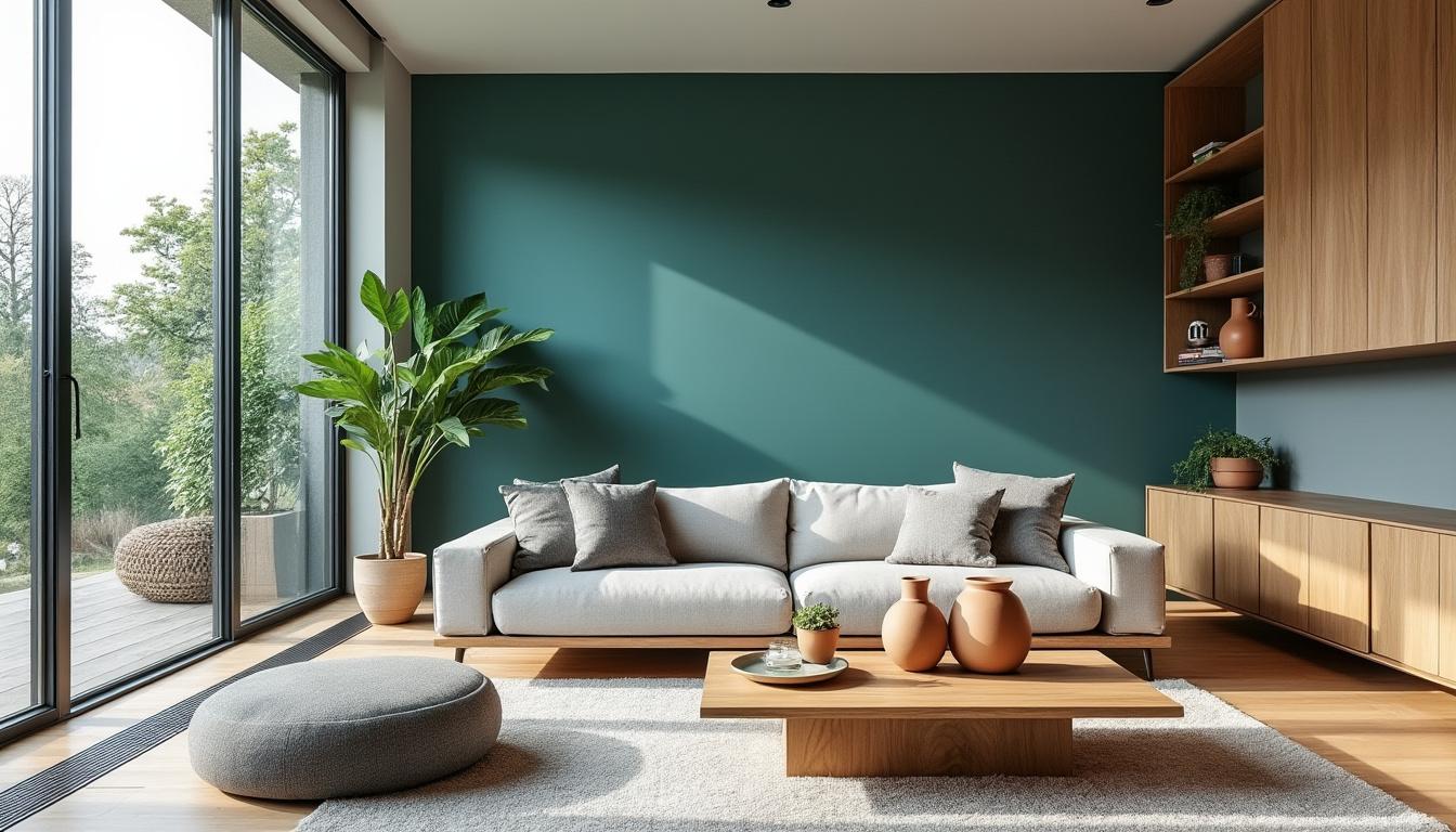
In 2026, the color that stands out the most is Transformative Teal, described by global trend consultancies as a hybrid between deep blue and aquatic green. This shade conveys serenity and presence, ideal for living rooms, bedrooms, and offices where concentration is desired without coldness. In the same vein, the Pure Blue announced by Coral reinforces the collective desire for balance and lightness, resonating with the idea of “breathing” within the home.
Brands are also proposing contrasts that enrich the palette: Lukscolor suggests Ocala, a warm clay, and Eucatex combines Rich Earth (deep earthy) with Porcelain (bright neutral). The result is a chromatic map that unites freshness, solidity, and versatility, ready for homes seeking intelligent welcome. In real projects, the controlled application of intense colors on the right surfaces avoids excess and prolongs the aesthetic life of the space.
How to apply the star colors of 2026 without regrets
In Lisbon, a bright T2 apartment received a Transformative Teal wall in the reading area, combined with light wood and raw linen. The color was applied only on the wall with the least direct sunlight to maintain visual freshness during the hottest hours. Conversely, in a compact apartment in Porto, Pure Blue was chosen for the narrow hall, creating a sense of order and freshness, while Porcelain was used elsewhere to enhance natural light. In a holiday home on the Bahian coast, Ocala brought warmth to the integrated living room, harmonized with natural fibers and matte ceramics.
- 🌊 Use Transformative Teal on feature walls, armchairs, and rugs.
- 🧊 Try Pure Blue in halls, bedrooms, and home offices for serene focus.
- 🏺 Accentuate with Ocala in ceramics, cushions, and earthy sideboards.
- 🔆 Balance Rich Earth + Porcelain: light base and earthy structural points.
- 🪵 Combine with certified wood, linen, and organic cotton for a consistent result.
| Trend color 🎨 | Best use 🛋️ | Complementary materials 🌿 | Climate/lighting ☀️ |
|---|---|---|---|
| Transformative Teal | Reading wall, headboard, rug | Light oak, linen, matte ceramics | Difuse light; great for visual cooling |
| Pure Blue | Hall, office, bedroom | Wool, brushed metal, ribbed glass | Focus and slow-down environments |
| Ocala | Living rooms and balconies | Natural fibers, terracotta, jute | Dry/tropical climates; comforting without heaviness |
| Rich Earth + Porcelain | Neutral base with earthy accent | Medium wood, sisal, cotton | Balance between light and coziness |
- 🎯 Start with a sample wall to observe light variations throughout the day.
- 🧩 Bring physical samples of fabrics and woods to check real harmony.
- 💡 Plan for warm light (2700–3000K) near dark tones to gain depth.
To close this part, the golden rule applies: a well-chosen neutral base multiplies the possibilities of colorful accents over the years.

Styles and materials in 2026: biophilia, natural textures, and technology for well-being
It’s not just about color; it’s also about how materials touch daily life. The design of 2026 favors the biophilic — connecting with nature through plants, light, textures, and organic patterns — and a silent technology that enhances comfort: low VOC paints, hypoallergenic fabrics, and dimmable lighting. The decor gains a sensory layer: linen texture, matte ceramic nuances, wood with visible grains, all in favor of coziness and air quality.
In practice, this means choosing fewer pieces, but with more substance. A table made of certified oak replaces two disposable items. Linen curtains filter sunlight without blocking ventilation, reducing the need for air conditioning. And plants, when well-positioned, contribute to visual and acoustic comfort, just like a wall with wooden panels that also serves as insulation.
How to bring nature indoors without turning it into a “garden”
In an apartment in Braga, the integration was simple: three large pots with low-maintenance species (zamioculca, snake plant, and pothos) placed near an east-facing window. The green speaks to sandy tones and a wool rug, creating a biophilic axis without exaggeration. Notice how the textures guide the composition: warm wood on the floor, breathable fabric on the sofa, matte ceramics on the sideboard.
- 🌱 Prioritize resilient plants according to the lighting of the space.
- 🪟 Combine cross ventilation with light curtains for thermal comfort.
- 🧪 Prefer low VOC paints and water-based varnishes.
- 🧵 Introduce natural textiles (linen, wool, organic cotton) for touch and health.
- 🔌 Use dimmers and LED profiles to control visual stimulation at nightfall.
| Material/solution 🧰 | Practical benefit ✅ | Usage care 🧽 | Ideal color pair 🎨 |
|---|---|---|---|
| Certified wood | Durability and thermal comfort | Keep dry and oiled | Earthy tones + Teal |
| Matte ceramics | Elegant texture and light diffusion | Gentle cleaning, no abrasives | Ocala + light neutrals |
| Linen and wool | Breathability and acoustics | Vacuum and air out | Pure Blue + sand |
| Dimmable LED | Visual comfort and savings | 2700–3000K in living areas | Warm dark tones |
There’s no magic formula: choose a few quality materials, connect them to a coherent palette, and tell a story. The result is an environment that embraces in every sense.
Purpose-driven dark and earthy tones: depth, coziness, and luminotechnical reading
The return of dark tones (black, navy blue, deep browns) in 2026 is not an aesthetic whim; it responds to the desire for intimacy and focus. Dark walls absorb more light, reducing glare and creating areas of visual rest — excellent for living rooms, libraries, or dining rooms. Meanwhile, the family of earthy tones (terracotta, ochre, sand) remains strong, pointing to naturalness and a warm embrace.
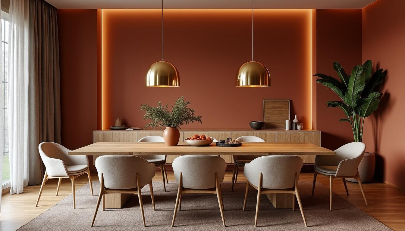
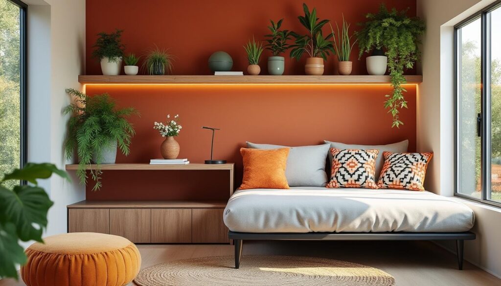
In homes with a lot of evening sun, a terracotta wall that receives light at the end of the day becomes alive and sophisticated. In warm climates, place dark tones on less sun-exposed interior surfaces to maintain thermal comfort. In cold or dimly lit regions, dark colors can visually warm the space, as long as they’re balanced with warm light and materials that reflect heat, such as brushed brass.
Lighting, contrast, and texture: the trio that dictates the outcome
A dining room in Aveiro received deep brown on the walls, a wooden table, and a brass pendant with 2700K bulbs. The light oak floor and sand-colored fabric chairs ensured balance. The secret was in the contrasts: light directed towards the table’s surface and a framed artwork that “breathes” with the whole.
- 💡 In dark walls, include wall washing light and a table lamp.
- 🖼️ Adopt art with a light frame to give visual pause to the darkness.
- 🪞 Use strategic mirrors to bring light back to deep corners.
- 🧱 Invest in textures: microcement, exposed brick, brushed wood.
- 🔥 Prefer warm metals (brass, copper) to reinforce coziness.
| Dark/earthy tone 🌒 | Where it works best 🏠 | Color temperature 💡 | Essential complements 🎯 |
|---|---|---|---|
| Navy blue | Home office, library | 2700–3000K | Medium wood, textured paper |
| Graphite black | Kitchen, metalwork details | 3000K with high CRI | Brass, light stone |
| Terracotta | Living rooms and balconies | 2700K | Ceramics, natural fibers |
| Burnt ochre | Hallways, niches | 2700K | Light artworks, mirrors |
- 🧭 Define the function of the environment before choosing color: resting, focusing, or socializing?
- 📐 Ensure contrast with light baseboards, ceilings, or lighter furniture.
- 🕯️ Install dimmable warm light to control the atmosphere at nightfall.
When the project articulates color, light, and texture, dark and earthy tones become sophisticated neighbors — not shadows.

Light and efficient neutrals: visual amplitude, comfort, and versatile base for 2026
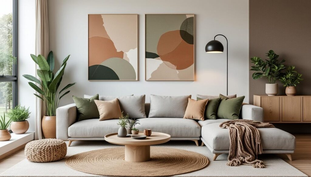
Light neutrals (warm whites, beiges, soft greys) remain leaders because they deliver amplitude, light, and versatility. In 2026, the guidance is to use the neutral base as a stage for vibrant accents and for natural materials that tell a story. In addition to aesthetics, there’s function: light paints with high LRV (Light Reflectance Value) amplify diffuse lighting and can reduce the need for artificial light during the day.
In practice, small rooms benefit from sandy-beige walls and raw linen curtains reaching the floor, aligned with the ceiling to stretch the height. Milky white kitchens gain warmth with brass handles and light stone countertops. Bedrooms with silk-grey walls and off-white bedding create the right environment to slow down.
How to choose the right neutral (and not a “hospital” white)
Observe sunlight orientation, flooring, and furniture. If the flooring is warm (oak, walnut), prefer slightly warm whites to avoid cold contrast. In homes with little light, very cool greys can feel gloomy; swap for a light sand that brings warmth. And remember: ceilings 5–10% lighter than the walls appear taller without “disappearing.”
- 🌤️ Use LRV above 70% for areas needing to reflect light.
- 🧴 Prefer washable low VOC paints in high-traffic areas.
- 🪑 Bring wood and textiles to warm very pale bases.
- 🎨 Reserve color accents for art, chairs, or a strategic wall.
- 🧪 Test large A3 samples on walls before deciding.
| Light neutral ☁️ | Estimated LRV 📊 | Best use 🧭 | Champion combination 🏆 |
|---|---|---|---|
| Warm white | 75–85 | Living rooms and bedrooms | Soft greens + light wood |
| Sand beige | 60–70 | Social areas | Terracotta + natural fibers |
| Silk grey | 55–65 | Bedrooms and offices | Pure Blue + raw linen |
| Light porcelain | 65–75 | General base | Rich Earth + brass |
- 🧭 Map out sun and shadows of the space throughout the day.
- 🧱 View samples on different walls and heights.
- 📝 Confirm with test paints before finalizing the purchase.
A well-thought-out neutral base becomes an investment: it adapts to changes in furniture, seasons, and moods with ease.
How to combine the trending colors of 2026 at home: practical steps, common mistakes to avoid, and low-waste solutions
The best way to get it right is to make the color choice a practical and reversible process. Instead of painting everything at once, create layers: a neutral base, a chromatic accent on a key surface, and accessories that tie the whole together. This approach reduces waste, controls costs, and allows for updates without renovations.
Proven step-by-step process
In a T3 in Faro, the renovation began by aligning light and layout. Then, Porcelain was chosen as the base, Transformative Teal for the reading wall, and terracotta for pots and blankets. The result was measured: more reading by the window and less visual fatigue at night thanks to dimming and warm bulbs.
- 🧭 Step 1: Define the function of each environment (focus, rest, socializing).
- 🎯 Step 2: Choose a accent color that dialogues with the base.
- 🧪 Step 3: Test large samples and observe for 48 hours.
- 🔧 Step 4: Adjust lighting (temperature and dimming) before final painting.
- ♻️ Step 5: Update with accessories (cushions, rugs, art) of low impact.
| Objective 🧩 | Suggested combination 🎨 | Key accessories 🪄 | Common mistake to avoid ⚠️ |
|---|---|---|---|
| Calm | Pure Blue + Porcelain | Linen curtains, wool rug | Using too cold light |
| Welcome | Ocala + sand | Jute, matte ceramics | Excessive objects |
| Focus | Teal + medium wood | 3000K table lamp | Bright wall |
| Vibrancy | Neutrals + lime green | Cushions, chairs | Using on all walls |
For those who love testing with low risk, accessories are the favorite tool. A rug can consolidate the palette and adjust the visual temperature. Want a practical guide on how to harmonize with the sofa? Learn how to match rug and sofa 👉 Keep reading.
- 🧰 Assemble a sample kit with cards, fabrics, and photos of the furniture.
- 📸 Take photos at different times and compare the next day.
- 🗑️ Donate or recycle excess paint in community projects.
A good project in 2026 is one that evolves with the life of the house. By combining colors with purpose, the space begins to work in favor of those who inhabit it — every day.
What is the best color of 2026 to start without fear?
Transformative Teal in small doses (one wall or armchair) is versatile and modern. If you prefer maximum safety, use Porcelain or a sand beige as a base and add the Teal in accessories.
Do dark tones weigh on small spaces?
No, as long as there is contrast and dimmable warm light. A navy blue wall with light baseboards and a table lamp creates depth without visually reducing the space.
How to use vibrant colors without tiring?
Choose a key surface (like the sofa wall) and keep the rest neutral. Reinforce with accessories in the same palette and leave doors and ceilings lighter to breathe.
What materials combine with the palettes of 2026?
Certified woods, matte ceramics, linen, wool, and warm metals (brass/copper). These materials add texture and comfort and support the discourse of well-being.
What color temperature to use with earthy and dark tones?
Prefer 2700–3000K (warm) with dimming. In dark kitchens, combine task light 3000K with high CRI for food color fidelity.


